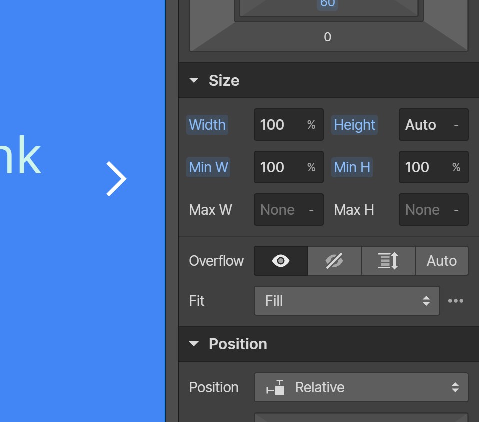
The Webflow Slider is not responsive by default and will overflow if the content is not uniform with a set height/min-height on the Slider ('.w-slider') element. This out-of-the-box configuration means it works well for Image Galleries, with images of the same height, but falls flat for content where the height is variable. However, with a bit of basic CSS, you can create a fully responsive Webflow Slider, and the key is a CSS Flex on the Slider Mask element ('.w-slider-mask').
Standard Webflow Slider
Responsive Webflow Slider
How to create a Webflow Responsive Slider
With your Standard Webflow Slider on the canvas, here is how to turn it into a Responsive Webflow Slider: -
1. Add a Webflow Embed element to the page containing the Slider and add the following CSS: -
2. Within Webflow Style dialogue, add the following CSS to 'Size' to the Slider (class 'w-slider'): -

3. Within Webflow Style dialogue, add the following CSS to 'Size' to the Slides (class 'w-slide'): -

These CSS tweaks are all you need to achieve a responsive slider in Webflow! Go ahead and style your responsive Webflow Slider and slides as necessary.
Pure CSS Webflow Responsive Slider Option
If you prefer to use pure CSS and have not set classes on the Slider, Slider Mask or Slides, you can add the full CSS below to your page via an Embed or in the pages 'Custom Code'.
Let us know how you have used our Webflow Responsive Sliders in the Comments below.


Join in the Discussion