

Suppose you are experiencing blurry or lower-than-anticipated quality images in Webflow when using appropriate image sizes and resolutions. In that case, the issue is probably due to a Responsive Image setting in Webflow.
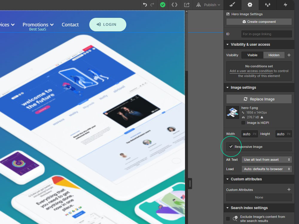
When uploading images to your site, Webflow automatically creates responsive variants of your images (2000px, 1600px, 1080px, 800px, and 500px) to ensure they load quickly at different breakpoints. Hence, the 'Responsive Image' setting is overall a valuable feature. However, if the result is blurry or of lower quality, we must revert to traditional optimised images (think Adobe Photoshop/Illustrator optimised images or TinyPNG for free online image compression) per the original upload quality and dimensions. Oddly reverting the 'Responsive Image' setting in Webflow is hidden by default, so follow these steps to deactivate it.
1. Click on the image that is blurry or displaying a lower-than-expected quality.
2. In the Settings panel on the right, click the cog for the Image settings.
3. Type CTRL+SHIFT+O on Windows or CMD+SHIFT+O on Mac.
4. The Responsive Image checkbox will now appear, and you can untick this setting.
5. Publish your website in Webflow to reflect the change.
Previously this loss of quality has been a great source of frustration as the initial thought is that something is wrong with the image itself. On this basis, it seems like a small change to the UI on the part of Webflow to make the setting permanently visible so that it's shown as a potential image update option.

.png)


Join in the Discussion